Posts tagged with design

Rainglow: a collection of beautiful handcrafted themes

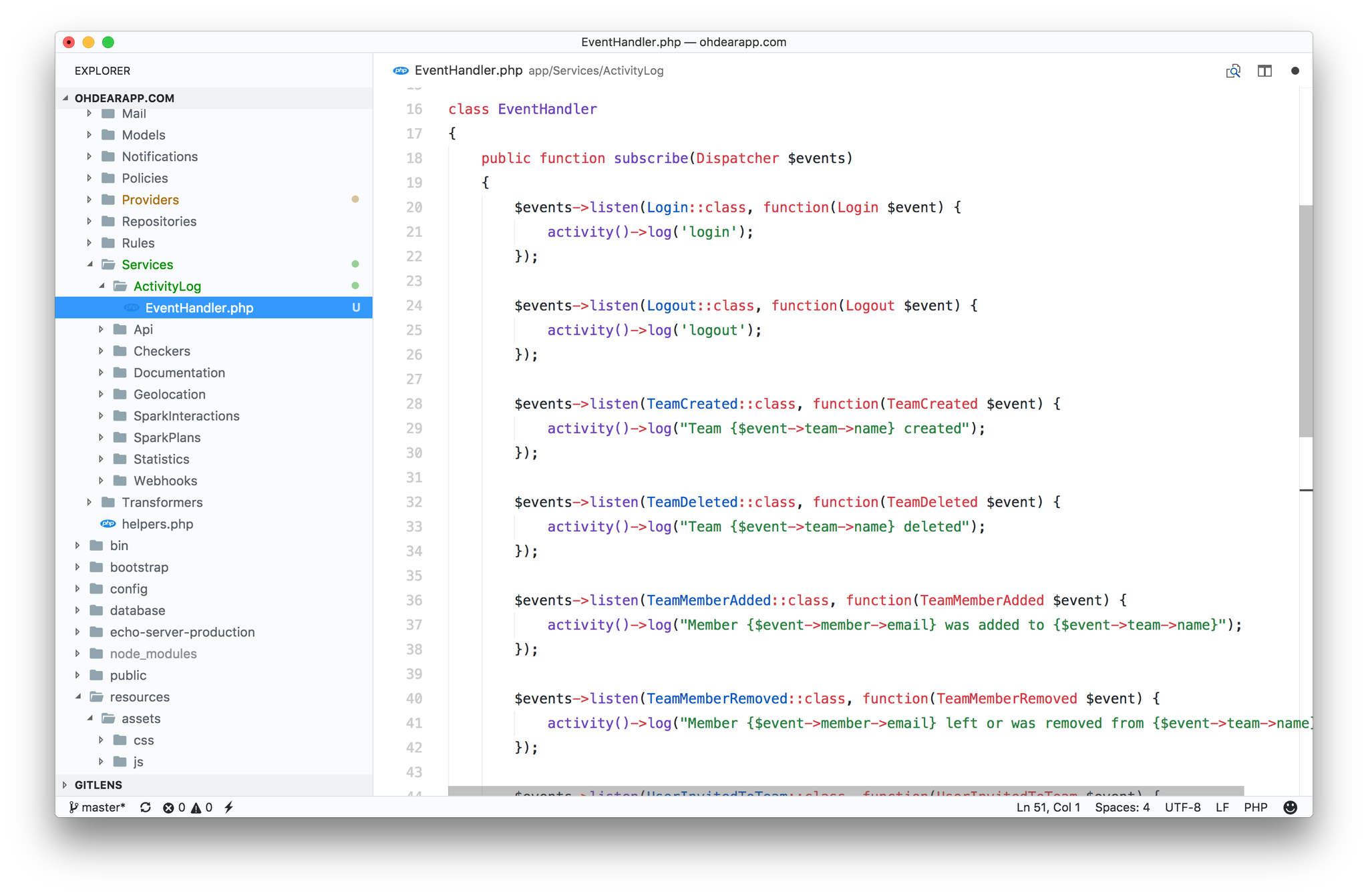
Dayle Rees, author of various popular books on PHP and Laravel, has recently blown new life into his efforts of creating IDE and terminal themes. He created themes for most of the popular apps out there including: PhpStorm, VS Code, Atom, iTerm2, ...

You can preview all the themes on: https://rainglow.io/

I've been using Dayle's Material Peacock for quite some time. Currently I'm digging white based themes and I'm on the GitHub theme.

github theme screenshot

Read more

Making a case for letter case

In an older, but still relevant, post on Medium John Saito demonstrates the effect of different capitalizations.

Can you spot the differences with the messages above? The left side has a few more capital letters than the right side. Big O, little o. Who cares, right?

Well, if you write for an app or website, you should care. A little thing like capitalization can actually be a big deal. Capitalization affects readability, comprehension, and usability. It even impacts how people view your brand.

We’ll get to the juicy stuff in a bit, but first, let’s start with a little more background about capitalization.

https://medium.com/@jsaito/making-a-case-for-letter-case-19d09f653c98

Read more

Join thousands of developers

Every two weeks, I share practical tips, tutorials, and behind-the-scenes insights from maintaining 300+ open source packages.

No spam. Unsubscribe anytime. You can also follow me on X.

Redesigning Laravel.io

In this blogpost by Tailwind CSS co-creators Adam Wathan and Steve Schoger share lots of actionable tips to improve the layout of your site.

Laravel.io is a forum and community portal for developers who use the Laravel PHP framework.

They recently launched a brand new version of the site, but being a volunteer-driven open source project, finding the resources to put together a really polished design can be tough.

We asked and got the go ahead to try our hands at a bit of a facelift, so let’s see what we can do to take the UI up a notch!

https://medium.com/refactoring-ui/redesigning-laravel-io-c47ac495dff0

Read more

Don't design your emails

You can spend a lot of time to make emails look pretty, but it might be better to just don't style them at all. Greg Kogan did some A/B testing an concluded that sending plain emails results in more opens, clicks, replies, ...

Why are the plain emails crushing the performance of designed emails?
  • They're less likely to be caught in spam filters. Having less HTML and fewer non-text elements such as images lowers the likelihood of triggering spam filters. You can use a free spam checker to validate this by testing plain and designed emails.
  • They're less likely to go into the "Promotions" tab in Gmail (used by ~16% of all email users), for the same reasons above. From my testing, the plain emails typically end up in the Updates tab and some times even in the primary tab. Of course, the text in the email also affects this.
  • They don't look like advertisements. The second the recipient interprets your email as an ad, promotion, or sales pitch—and it does take just a second—its chances of being read or acted upon plummet towards zero. A plain email leads people to start reading it before jumping to conclusions.
  • They feel more personal. It's no handwritten note, but it's much more personal than an over-designed email with the recipient's first name crammed somewhere inside.

https://www.gkogan.co/blog/dont-design-emails/

Read more

6 tips that will improve your typography on your UI

Steve Schoger, a well known designer in the Laravel community, wrote down some good, actionable tips to improve your typography.

When I say typography, I’m not just referring to the font selection (although that is one important factor), I am referring to the entire composition of it. In this post, I’ve compiled a list of some important elements you can consider to create beautiful typography.

Let's get started!

http://www.steveschoger.com/2017/07/19/6-tips-that-will-improve-your-typography-on-your-ui/

Read more

CSS Utility Classes and "Separation of Concerns"

In my day to day work I don't write any css at all, but I still very much enjoyed this blogpost by Adam Wathan where he shares some interesting things about how css should be structured and he makes the case for using utility classes to make visual tweaks.

When you think about the relationship between HTML and CSS in terms of "separation of concerns", it's very black and white.

You either have separation of concerns (good!), or you don't (bad!). This is not the right way to think about HTML and CSS. Instead, think about dependency direction.

...

One of the biggest benefits of using small, composable utilities is that every developer on your team is always choosing values from a fixed set of options.

https://adamwathan.me/css-utility-classes-and-separation-of-concerns/

Read more

On Being Explicit

Mathias Verraes, one of the organizers of DDD Europe, recently gave a talk at DDD London on how to name things to both improve your code and to improve communication with the business.

“Make the implicit explicit” must be one of the most valuable advices I ever got about software modelling and design. Gather around for some tales from the trenches: stories from software projects where identifying a missing concept, and bringing it front and centre, turned the model inside out. Our tools: metaphors, pedantry, type systems, the age old heuristic of “Follow the money”, visual models, and a healthy obsession with language.

https://skillsmatter.com/skillscasts/8806-ddd-meetup

Read more

Top 5 programming fonts

Eric L. Barnes of Laravel-news and dotdev fame, did a little research on the most used fonts for programming.

Everyone has their ideal development setup, and many have spent countless hours customizing it to perfectly suit their needs. Outside of a color scheme, the next typical change is the font in use and every year new fonts are introduced giving us more to choose from than ever before.

To find out what everyone is using, I asked on Twitter and Facebook and had a ton of responses. Based on the answers here is a list of the top 5 programming fonts in use today

https://laravel-news.com/2016/10/top-5-programming-fonts/

I'm a big fan of Fira Code myself. It has some nice ligatures and it just looks very good. Here it is in action in my IDE:

screen-shot-2016-10-21-at-23-56-34

Read more

How to design words

John Saito, a designer at Dropbox, wrote down some very useful tips to improve the text in your UI.

Technically speaking, I’m a writer. I get paid to write words. But here’s something most people don’t know about me: I hate to read. ... You see, I mostly write interface text for apps and websites. It’s a style of writing where brevity beats brilliance, and every character counts. Writing interface text is actually a lot like design—designing words for people who hate to read.

https://medium.com/@jsaito/how-to-design-words-63d6965051e9

Read more

The grid layout for our dashboard

by Freek Van der Herten – 7 minute read

The grid layout for dashboard.spatie.be was conceived with 3 simple ideas in mind: The layout has to be lightweight on the client side: no JavaScript calculations or full-blown grid library should be used. The HTML structure in the templates has to be clean, without extra markup for rows and…

Read more

Type safety and money

Mathias Verraes illustrates with practical examples how PHP's type system can be used when designing a system.

Below is an attempt at illustrating a design/redesign process I went through at a client, who’s started refactoring the core systems their business depends on. Design is the part of software development that is the most messy, the hardest to fit into rules or well-defined processes. In fact, while writing this post, I tweeted:

“There are surprisingly few software design books that recommend taking a walk, a shower, or a nap, as an important step.”

None of the solutions offered below should be taken as truth. I may have already changed my mind on some of them by the time you read them.

http://verraes.net/2016/02/type-safety-and-money/

Read more

A beautiful PHPStorm theme

PHPStorm is the application I'm working in most of the time. So I want it to be as pretty as it can be. Right out the box PHPStorm contains two bat shit ugly themes: the default white one and the slightly better Darcula.

Fortunately for all PHPStorm users out there long time Laravel community member Dayle Rees showed us the way to the light! A few years ago he created an abundance of colour schemes that are a pleasure to the eye. You can view all the schemes on the demo page.

More recently Dayle created a new colour scheme called Material Peacock. This is what it looks like:

material

Very nice! Almost everywhere I open up PHPStorm people ask what that theme is, so I'm certainly not the only one who digs it. At this year's PHP UK Conference a PHPStorm-engineer from Jetbrains said it was the most beautiful theme he ever saw in his own product.

You find instructions on how to install the theme (made by Chris Magnussen) and the colour scheme in Dayle's Material Peacock repo on GitHub.

Read more

A beginner’s guide to information architecture

... information architecture is the creation of a structure for a website, application, or other project, that allows us to understand where we are as users, and where the information we want is in relation to our position. Information architecture results in the creation of site maps, hierarchies, categorizations, navigation, and metadata.

Information architecture is a task often shared by designers, developers, and content strategists. But regardless of who takes on the task, IA is a field of its own, with influences, tools, and resources that are worth investigation. In this article we’ll discuss what information architecture really is, and why it’s a valuable aspect of the user experience process.

http://www.uxbooth.com/articles/complete-beginners-guide-to-information-architecture/

Read more

How to make syntax highlighting more useful

We think syntax highlighting makes the structure of code easier to understand. But as it stands, we highlight the obvious (like the word function) and leave most of the content in black. Rather than highlighting the differences between currentIndex and the keyword function, we could highlight the difference between currentIndex and randomIndex. Here’s what that might look like:1-TVSPOYO1z8GOVs3tuxNRqA
https://medium.com/@evnbr/coding-in-color-3a6db2743a1e

Read more