I'm currently organising the third edition Full Stack Europe. It's a conference in Antwerp, Belgium in October for developers who want to learn across the stack. We have a great line up with lots of familiar faces! Register your ticket now!

A new design for Ignition

Original – by Freek Van der Herten – 5 minute read

A couple of years ago, Ignition became the default error page in Laravel.

Ignition provided a vastly improved design over Whoops: it brought Laravel specific niceties (such as showing the routing, queries) and the ability to display and even run solutions (e.g. generating an app key).

At Spatie, we think we can improve the design of Ignition even more. Our initial plan was to release this new design in tandem with Laravel 9 as a big bang surprise release. We've changed our mind on this because we'd like to have feedback from the community.

In this blog post, I'd like to share our ideas and plans for Ignition.

An improved design

The most visible change is that we're tinkering with a new design. Here's the latest version of our mockup:

screenshot

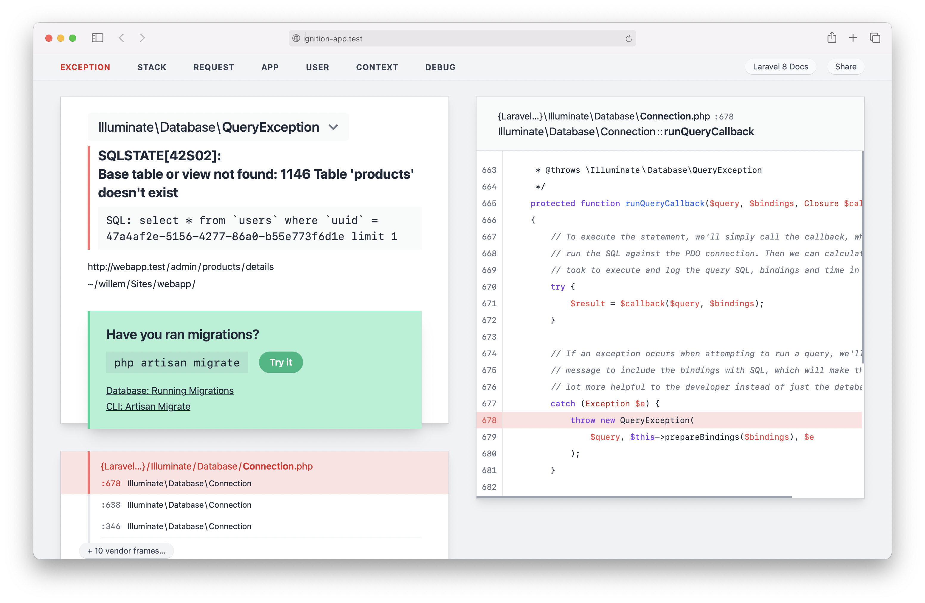
The current release version of Ignition has a lot more empty space. The information density has increased in our new design; there's more information on a smaller space.

When viewing Ignition on a larger screen, you can see that we make better use of the space. Click on the image to see it in full size.

screenshot

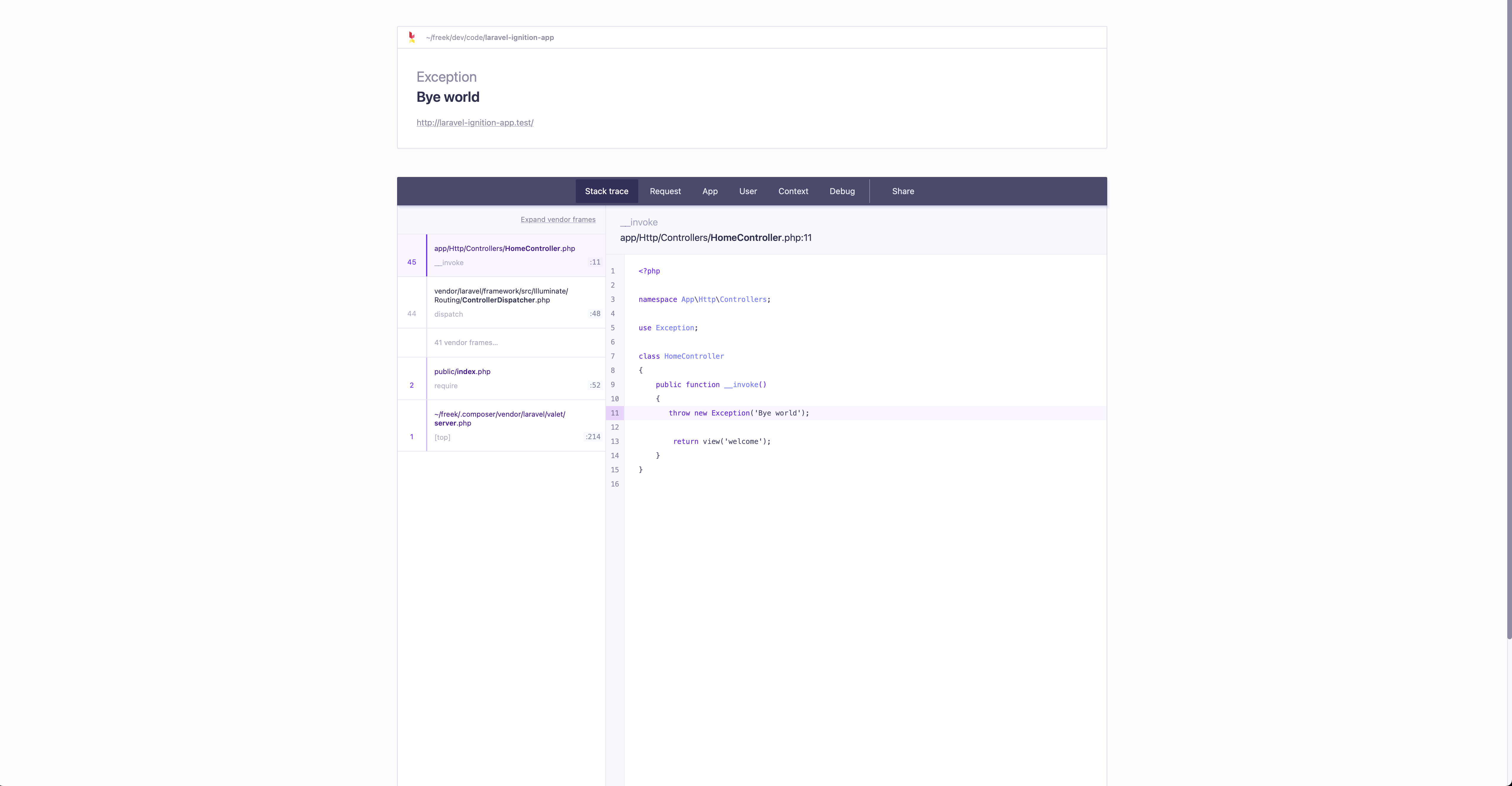
For reference, here's how the current Ignition version looks like:

screenshot

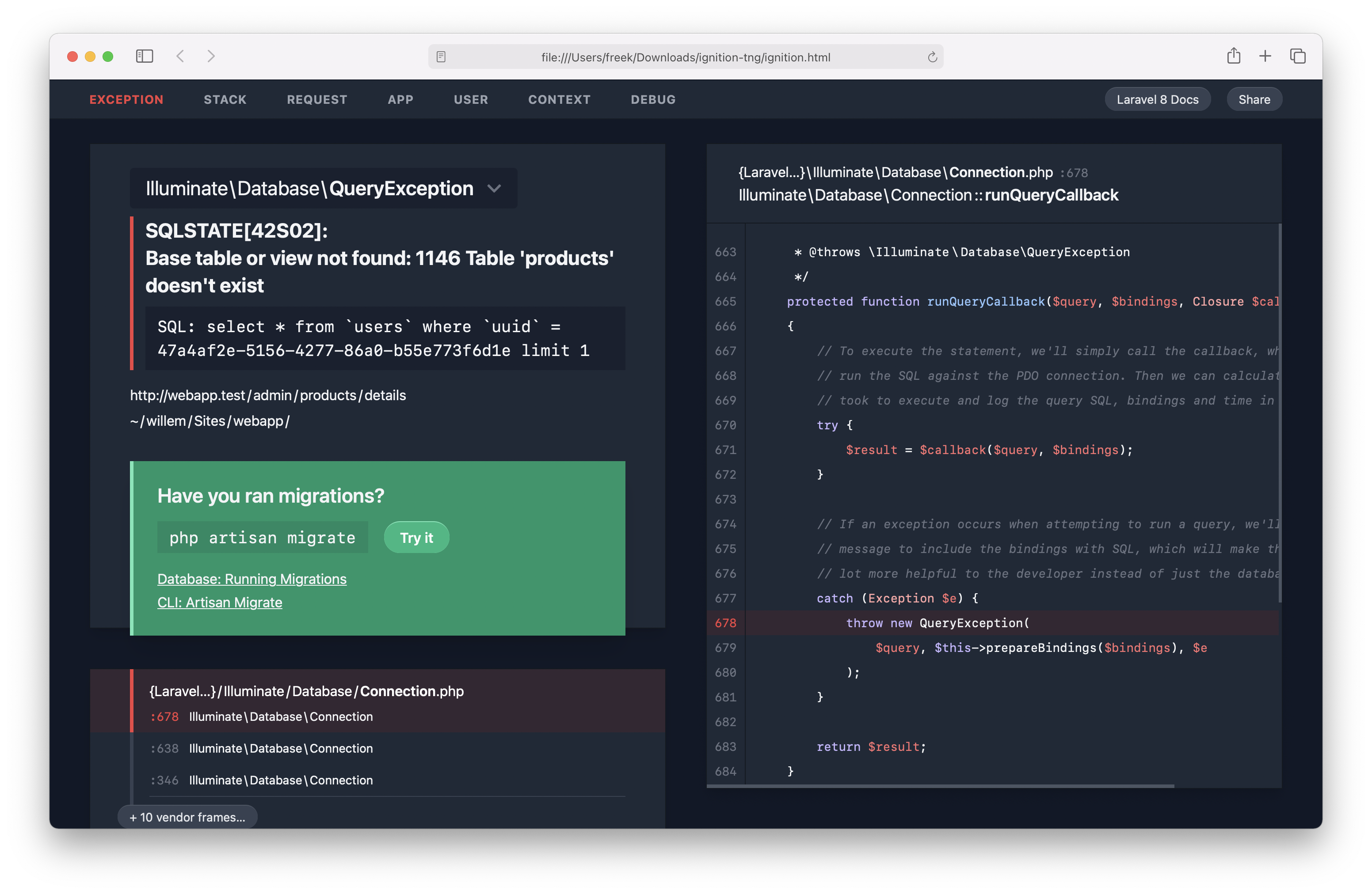
And of course, there's also a beautiful dark mode for people that claim that white-based things hurt their eyes.

screenshot

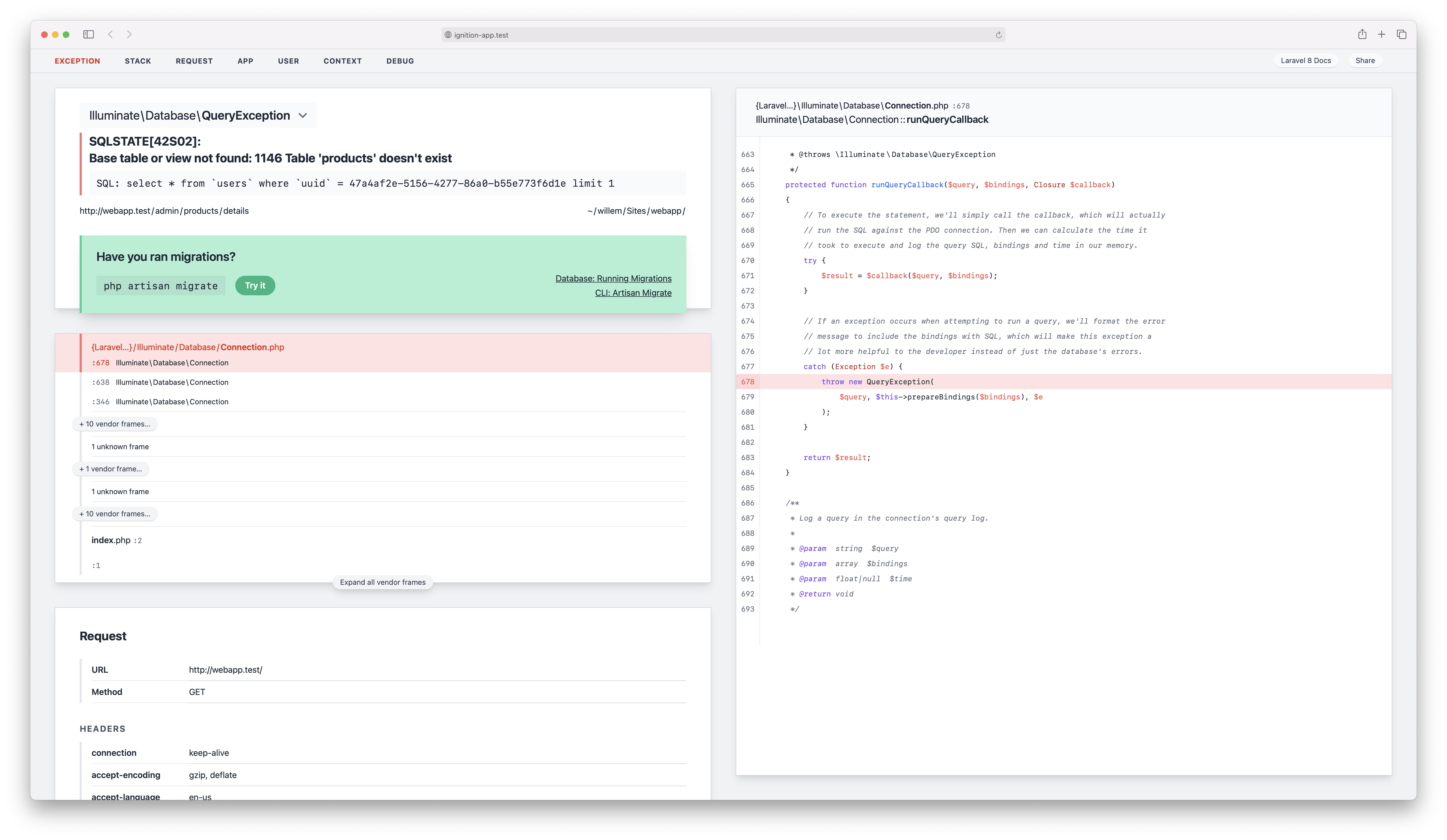
One thing that we didn't like about the current Ignition version is that you have to click to see the other tabs like "Request", "App", "User", and so on. You can still click those names in the heading in the new design, but you can also scroll down. No clicks needed anymore to see all the info.

screenshot

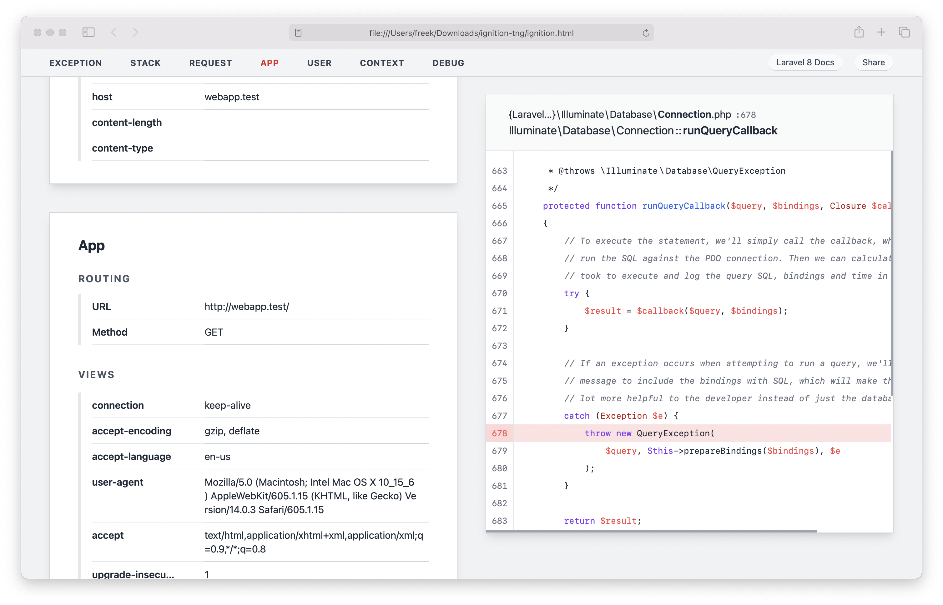
In the header of the new design, you'll also see a button that brings you to the Laravel docs. A neat thing is that you will get brought to the correct version of the docs (so, in Laravel 8 app, that link will point to v8 of the docs).

Of course, when the new Ignition design is launched, we'll also update how exceptions are shown in Flare to match Ignition.

Sharing exceptions

We'll also bring changes in how an exception can be shared via Flare. On the current Ignition page, you'll get a menu where you'll get an admin link and a public link after an error is shared. The idea is that you can send the public link to persons that you'd like to share your exception with. The admin link can be used to delete the shared error if needed.

In the new version of Ignition, this will work differently. We think that it's better for everyone if we don't store exceptions indefinitely. That's why we are going to keep a shared error only around for one day. This way, you can safely share data knowing that we'll scrub it from Flare quite fast.

A simplified codebase

Before starting implementing the design, we cleaned up the current codebase. Facade/ignition is quite a heavy package, and we wanted to simplify it. That's why we split it up in two new packages: spatie/ignition (which is framework agnostic) and spatie/laravel-ignition (which contains the Laravel specific bits).

These two packages feel much lighter, making them easier for us to maintain. We decided to put the new versions of Ignition on our own Spatie GitHub organisation as the legal entity behind Facade is winding down.

There isn't a stable version tagged of spatie/ignition or spatie/laravel-ignition just yet, but it all should work. If you're feeling adventurous and want to provide us with feedback, please try them out.

We can only dream, but it would be pretty cool to see Ignition being used by developers of Symfony, WordPress and other frameworks.

Moving forward

facade/ignition will remain the default error page in Laravel 8. We'll also continue maintaining it for Laravel 8 and below.

spatie/laravel-ignition will be compatible with Laravel 8, so those who want to switch after a stable release is available. If all goes according to plan, Laravel 9 will use spatie/laravel-ignition as the default.

In closing

I hope that you like the changes we have in store for Ignition.

As mentioned above, we didn't implement the new design shown above just yet. It's now in the idea phase. In the next couple of weeks, you'll see us add it to spatie/laravel-ignition.

We welcome your feedback on the new design and our plans. Let us know via Twitter or comment below this post.

If you like the design, also thank my colleague Willem, he's the one that makes everything cooked at Spatie look pretty.

Stay up to date with all things Laravel, PHP, and JavaScript.

You can follow me on these platforms:

On all these platforms, regularly share programming tips, and what I myself have learned in ongoing projects.

Every month I send out a newsletter containing lots of interesting stuff for the modern PHP developer.

Expect quick tips & tricks, interesting tutorials, opinions and packages. Because I work with Laravel every day there is an emphasis on that framework.

Rest assured that I will only use your email address to send you the newsletter and will not use it for any other purposes.

Comments

What are your thoughts on "A new design for Ignition"?

Comments powered by Laravel Comments
Want to join the conversation? Log in or create an account to post a comment.

Webmentions

dan_in_tweets liked on 8th July 2021
Fortez Fabrice liked on 8th July 2021
juan pineda replied on 8th July 2021
Hey, I would love to help out, any help u need I can, just guide me in the right direction
Mark Topper liked on 8th July 2021
José Cage liked on 8th July 2021
Dot liked on 8th July 2021
FatlumGJ liked on 8th July 2021
David Hewitson liked on 8th July 2021
Peter Brinck 🤘 liked on 8th June 2021
Leonardo Ribeiro liked on 8th June 2021
Joel Jensen liked on 7th June 2021
driedeeshop.nl liked on 7th June 2021
Dmitry Astratyan liked on 6th June 2021
ricklambrechts liked on 6th June 2021
Tauseef Shah liked on 6th June 2021
Nathanael McDaniel 🖥 liked on 6th June 2021
Lukáš Neuschl liked on 6th June 2021
Blue Whale liked on 6th June 2021
Preslav Rachev liked on 6th June 2021
Stijn Vanouplines liked on 6th June 2021
Joren Van Hocht liked on 5th June 2021
José Cage liked on 5th June 2021
Abrar Ahmad liked on 5th June 2021
Olivier Van de Velde liked on 5th June 2021
Silvan Hagen 🦊 liked on 5th June 2021
Gaurav Makhecha liked on 5th June 2021
Alex liked on 4th June 2021
Lewis Newton liked on 4th June 2021
Lawrence Enehizena liked on 4th June 2021
Lord_Sharkca liked on 4th June 2021
David Adi Nugroho liked on 4th June 2021
Jorge González liked on 4th June 2021
mark walravens liked on 4th June 2021
Wilman Barrios liked on 4th June 2021
Gustavo Edny liked on 4th June 2021
Mohamed Alaa liked on 4th June 2021
Łukasz Gręźlikowski liked on 4th June 2021
ketsakda liked on 4th June 2021
Dan Horrigan liked on 4th June 2021
🧙‍♂️ Jeff Kilroy liked on 4th June 2021
Reece M replied on 4th June 2021
If it's okay to ask, is there a reason to change the design? --- I like the link to the docs being prominent, maybe if it is a commom error, you can use that to link to the doc page related to it.
Hamdi Gaied liked on 4th June 2021
Ali Ali liked on 4th June 2021
Norbert Tóth liked on 4th June 2021
Lee Overy liked on 4th June 2021
Emrullah Tanıma liked on 4th June 2021
Viktor liked on 4th June 2021
Ben Sherred liked on 4th June 2021
Ferdinand AMOI liked on 4th June 2021
Yesaya Software liked on 4th June 2021
Danijel K. liked on 4th June 2021
Maarten de Graaf liked on 4th June 2021
Ste Lasowski liked on 4th June 2021
J.O.Y liked on 4th June 2021
smknstd liked on 4th June 2021
Christian nsh liked on 4th June 2021
Rene Roscher liked on 4th June 2021
Carlos F liked on 4th June 2021
Robin Dirksen liked on 4th June 2021
Catalin Banu liked on 4th June 2021
FoFa liked on 4th June 2021
Kamarool Karim ⚡️ liked on 4th June 2021
gerald 🤍 liked on 4th June 2021
Tom Witkowski 🦦 replied on 4th June 2021
Too much on a single page. The current one is totally fine.
Lars Klopstra ⚡ replied on 4th June 2021
I think the only issue is that the frames feel disconnected from the code output and the exception blending in with the other panels. I like the looks of it tho
Void 🌒 replied on 4th June 2021
I like some of the stylistic changes but the layout definitely was better before. I think the single column with info hidden behind tabs is a fantastic way to reduce cognitive load, and make errors feel less intimidating. Low information density is definitely a feature not a bug.
Meshack Victor replied on 4th June 2021
I think the first design was better, scrolling down is always better than scrolling sideways🤷‍♂️🤷‍♂️🤷‍♂️ and most of the time i would have a hint of what i ddnt do right just after seeing the error title
Tbh, the current one is looks nicer and gives a better UX.
Robin Martijn replied on 4th June 2021
I mainly look at the error message. If I don't see where that's coming from, I'll have a brief look at the filename and line number. The code takes up a huge part of the space here, while that's the thing I use the least. I'm perfectly comfortable with scrolling to the code.
Taylor Maguire replied on 4th June 2021
I like the new styling/theme. Menu at the top is nice. Utilizing the full screen width is great. I do prefer the stacked approach more though, scrolling up and down is okay but left to right is frustrating.
Sadegh 🐘 liked on 4th June 2021
Amir Adel replied on 4th June 2021
You’ve always got fonts & layouts looking good, but I have to agree with most people in here, the shots posted seems to be crowded and confusing
Karl Monson liked on 4th June 2021
Harsh Shah liked on 4th June 2021
Tyler Wiegand liked on 4th June 2021
Anthony Peck liked on 4th June 2021
Leonardo Prabangkoro liked on 4th June 2021
No.Mix liked on 4th June 2021
NAbeel Yousaf 🇵🇰 liked on 4th June 2021
nero liked on 4th June 2021
Abrar Ahmad liked on 4th June 2021
Yusuf Abdul Razaq replied on 4th June 2021
To me it would be best if application related errors are thrown first before other exception rather than scrolling down
Lars Schou 🇩🇰 liked on 4th June 2021
Parthasarathi G K liked on 4th June 2021
imtiaz shakil liked on 4th June 2021
Khai Rahman liked on 4th June 2021
Godruoyi liked on 4th June 2021
M.O.U.D ® retweeted on 4th June 2021
Manuel Pirker-Ihl liked on 4th June 2021
J. Mir liked on 4th June 2021
repat liked on 4th June 2021
Hussain Afeef replied on 4th June 2021
Usually I check three things, 1. the error message. Can understand the issue most of the times 2. the code and error line 3. then the file stack I think the focus on error file stack is minimised in this design. However, i like the design.
Tomas Sek liked on 4th June 2021
Hussain Afeef liked on 4th June 2021
CJ Garcia liked on 4th June 2021
Divan liked on 3rd June 2021
Plutão é Planeta liked on 3rd June 2021
Mauro Farah liked on 3rd June 2021
Daniel Rodríguez liked on 3rd June 2021
Russ Clewett liked on 3rd June 2021
Adnan Shaukat liked on 3rd June 2021
Artem liked on 3rd June 2021
Niclas Kahlmeier liked on 3rd June 2021
Max Eckel liked on 3rd June 2021
Salman Zafar liked on 3rd June 2021
Craig Potter 💻🐒 liked on 3rd June 2021
Joining the "overcrowded" team
Reza Amini liked on 3rd June 2021
necer liked on 3rd June 2021
Ciro Lo Sapio liked on 3rd June 2021
Leith Caldwell liked on 3rd June 2021
Noe liked on 3rd June 2021
Manuk Minasyan liked on 3rd June 2021
Timothé Pearce replied on 3rd June 2021
You should keep the single column from the current version on low resolution.
Isak Berglind liked on 3rd June 2021
Steve Bauman liked on 3rd June 2021
Ryan Scherler liked on 3rd June 2021
Ruud Schaaphuizen liked on 3rd June 2021
Johan Ronsse replied on 3rd June 2021
overdesigned
Vikram Bhaskaran liked on 3rd June 2021
Simon Kollross liked on 3rd June 2021
Bobby Bouwmann replied on 3rd June 2021
I like the current design. It gives you a good overview. I do see some improvements because I always need to scroll down for more information. Anyway, keep up the good work 🙌
love it!
Ethan âp Paul ⚡ liked on 3rd June 2021
Bjarn Bronsveld replied on 3rd June 2021
Bit too crowded/cluttered. The current one is spacious and clear. The idea is cool, though
David Cottila retweeted on 3rd June 2021
Spatie retweeted on 3rd June 2021
Mohan Raj retweeted on 3rd June 2021
Mark Duffy 🏠 liked on 3rd June 2021
Alexander Six liked on 3rd June 2021
Jethro May liked on 3rd June 2021
Jeidison Farias liked on 3rd June 2021
Zemmouri Rediane liked on 3rd June 2021
Mohan Raj liked on 3rd June 2021
Davide Bellini liked on 3rd June 2021
!happy liked on 3rd June 2021
Mateus Galasso liked on 3rd June 2021
José Cage liked on 3rd June 2021
Tim MR liked on 3rd June 2021
Ronildo liked on 3rd June 2021
Baran Hocaoglu liked on 3rd June 2021
Patrick liked on 3rd June 2021
Johan Alvarez liked on 3rd June 2021
vova.yatsyuk liked on 3rd June 2021
chetan kharel 🚀 retweeted on 3rd June 2021
Rias Van der Veken retweeted on 3rd June 2021
Vidican Sergiu Danie liked on 3rd June 2021
Jon Dingman liked on 3rd June 2021
Fortez Fabrice liked on 3rd June 2021
chetan kharel 🚀 liked on 3rd June 2021
Aadil Agwan liked on 3rd June 2021
Jack Watling liked on 3rd June 2021
Chin Leung liked on 3rd June 2021
meduz' liked on 3rd June 2021
Felix Schmid liked on 3rd June 2021
Omid van der Linden liked on 3rd June 2021
Tyler Smith liked on 3rd June 2021
Willan Correia liked on 3rd June 2021
🟣 Yaniv Harush liked on 3rd June 2021
🇧🇷Renato Lucena🐧 liked on 3rd June 2021
Emre liked on 3rd June 2021
linux Dev liked on 3rd June 2021
Daniel liked on 3rd June 2021
Rias Van der Veken liked on 3rd June 2021
Estern Winluck replied on 3rd June 2021
Crowded, just improve the existing one
theonlyub liked on 3rd June 2021
Steve McDougall replied on 3rd June 2021
I like it!
Aadil Agwan replied on 3rd June 2021
Zak Nesler replied on 3rd June 2021
Looking good! I like the overhanging section in spirit, but I don't think it hangs over enough to look like it was done on purpose. Maybe increase the offset?
Tyler Smith replied on 3rd June 2021
It's really pretty, but my eye doesn't know where to look. There's a lot going on in this design.
Niff liked on 3rd June 2021
Daniel Freitas liked on 3rd June 2021
Ruslan liked on 3rd June 2021
René Sinnbeck liked on 3rd June 2021
Levente Balogh-Korodi retweeted on 3rd June 2021
Nuno Maduro retweeted on 3rd June 2021
PHP Synopsis retweeted on 3rd June 2021
Luke Downing retweeted on 3rd June 2021
Tyler Woonton liked on 3rd June 2021
Sebastian De Deyne retweeted on 3rd June 2021
Mateus Guimarães liked on 3rd June 2021
Tony Messias liked on 3rd June 2021
Nuno Maduro liked on 3rd June 2021
Sebastian De Deyne liked on 3rd June 2021
Levente Balogh-Korodi liked on 3rd June 2021
Tiago Rodrigues liked on 3rd June 2021
Dries Vints liked on 3rd June 2021
Luke Downing liked on 3rd June 2021
owls liked on 3rd June 2021
Mateus Guimarães replied on 3rd June 2021
The error pages are going to look better than my apps
Tiago Rodrigues replied on 3rd June 2021
It is amazing 🤯