Details That Make Interfaces Feel Better
– jakub.kr
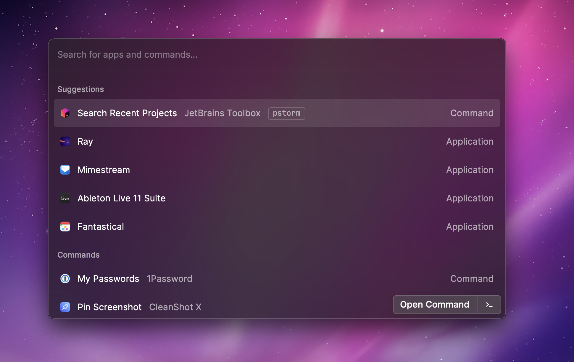
Jakub shares a collection of small interface details that compound into a much better user experience, from text wrapping and concentric radius math to interruptible animations and optical alignment. It is packed with practical UI polish ideas that are easy to miss, but hard to unsee once you notice them.
Read more [jakub.kr]