A Vue component to display tabs original
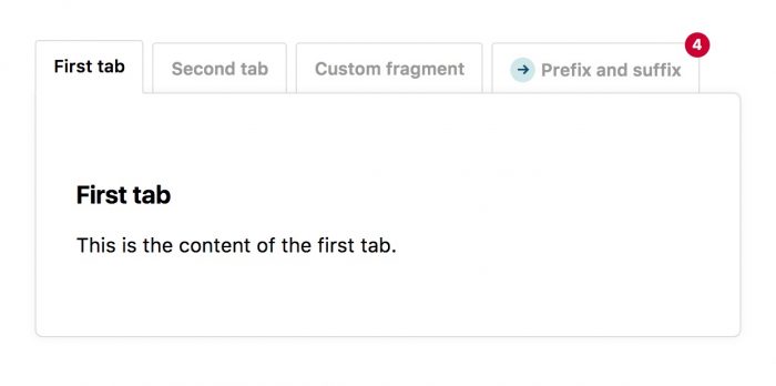
Last week my company released a vue-tabs-component, a quality Vue component to easily display tabs. You can view a demo of the component here. In this post I'd like to tell you all about it.
Why we created it
If you're just want to know what the component does, skip to the next section.
Nearly all projects we deliver are powered by Blender, our Laravel application template. Blender has an admin section where users can manage content. For every content type it provides a crud interface. Nothing special there. But sometimes those content type can be pretty complex and have many many fields. Instead of displaying all the fields at once we put fields that belong in their own tap. So their might be a tab "Content" with some general fields, a tab "Media" with everything regarding images and uploads, ... This tab behaviour is provided by some custom JavaScript.
Currently the JavaScript used in Blender is a bit of a patchwork. Because we nowadays use quite a bit of Vue in client projects we decided to make Vue a first class citizen in the admin section as well. We're currently searching an building Vue components to use in Blender. The tabs component is the first one that we finished building. Though it's a bit opinionated towards our use case, the component was generic enough to open source.
Introducing vue-tabs-component
If haven't already done so, head over to the demo page to get a feel of what the component can do.
If you can registered the component globally like this:
//in your app.js or similar file
import Vue from 'vue';
import {Tabs, Tab} from 'vue-tabs-component';

Vue.component('tabs', Tabs);
Vue.component('tab', Tab);
you can use this piece of html to render the tabs like they are displayed on the demo page.
<tabs>
    <tab name="First tab">
        This is the content of the first tab
    </tab>
    <tab name="Second tab">
        This is the content of the second tab
    </tab>
    <tab id="oh-hi-mark" name="Custom fragment">
        The fragment that is appended to the url can be customised
    </tab>
    <tab prefix="<span class='glyphicon glyphicon-star'></span> "
         name="Prefix and suffix"
         suffix=" <span class='badge'>4</span>">
        A prefix and a suffix can be added
    </tab>
</tabs>
Easy right?
The component doesn't come with any styling. If you like the pretty looks of our the demo, you can snatch the css used on GitHub.
Some nice features
The component will use the fragment of the url to choose which tab to open. So clicking navigating to https://example.com#second-tab will display the contents of the tab named Second tab.
The component will also remember which tab was opened previously. If you reload without fragment the tab that is currently active will receive focus again. You'll find more about this feature on Github.
The rendered output of the component adheres to the ARIA specification. Aria stand for "Accessible Rich Internet Applications" and describes which attributes html nodes should have in order to make the component accessible to people with disabilities
Testing the component
If you look at the source code of the projects you'll notice that has a test suite to make sure it works properly. Want to know more about how those tests are set up? Then head over the dedicated series of posts on those tests.
In closing
Head over the repo on GitHub to learn more about the component. Though our focus in open source is more creating on Laravel and PHP framework agnostic stuff, take a look at these other JavaScript packages we've previously made.
